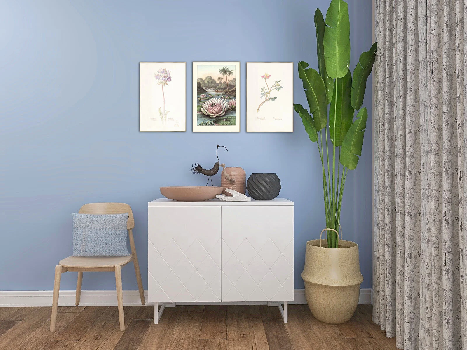
One corner…5 different looks…Art inspiring .
Today, let’s talk about Art. Art is the one thing I feel is so subjective and can create arguments galore in my house. What my husband likes, I don’t and vice versa. I normally get my way (of course!) but it is one area where I do ask for his opinion.
The thing with art is how many is too many. Gallery walls are great if you have the time and energy to create one and get it all looking straight and co-ordinated. I personally prefer a ‘less is more’ vibe. One, two or three (sometimes 4) is my motto. The usual interior design rule of odd numbers 3, 5 , 7 etc is what we mostly go by but I like to break the rules and like pairs of art work or just one large piece all on its lonely only. Although, talking of rules, here are some you should remember
Don't hang the artwork too high, you don’t want to be looking up or looking down at your central piece. Too high and you may make your room feel claustrophobic.
The centre point of your main art work should be at eye level, keep this level throughout your home for consistency.
Don't hang pieces too far apart from each other, approximately two inches on either side, below and above is enough space.
Make sure your pieces are visually balanced, so don’t have the big pieces together and all the small pieces together. Mix things up a bit.
Keep uniformity through the same type of frame or same finish.
Hang four smaller pieces if you don’t have one large piece or one large piece of art work and two smaller ones either side.
Top Tip: If you are going for a gallery wall with lots of art, lay all your pieces on the floor and work out where everything goes before committing to the wall.
This month I am loving all the beautiful line drawings out there, in particular the work by the artist Peytil, he is also amazing to watch at work where he swishes his brush over the page and hey presto he produces these amazing figures of people. It looks so easy…it is not…I have tried!! The Morgondagg print is so gorgeous, all you need is one! Simple, elegant and understated. Another piece by Liv Due’s Cloudisone print exclusively sold on Peytil website. One of my favourite online shops is Junique where you can find lots of different prints and inspiration. My favourites this month are the Blue Heron, the Water Lily paired with the Thistle and Lupin prints and the dark and moody, Thorned Bulbous Plant prints. See all these below in some renders I created, with a Farrow and Ball Lulworth blue backdrop. One corner, 5 looks!
Need help with your art selection? I offer bespoke service just to help with that


