How to update your home for Spring

Spring is a time of renewal, and it's the perfect opportunity to update your home with a fresh new look. Here are some ways to update your home for spring:

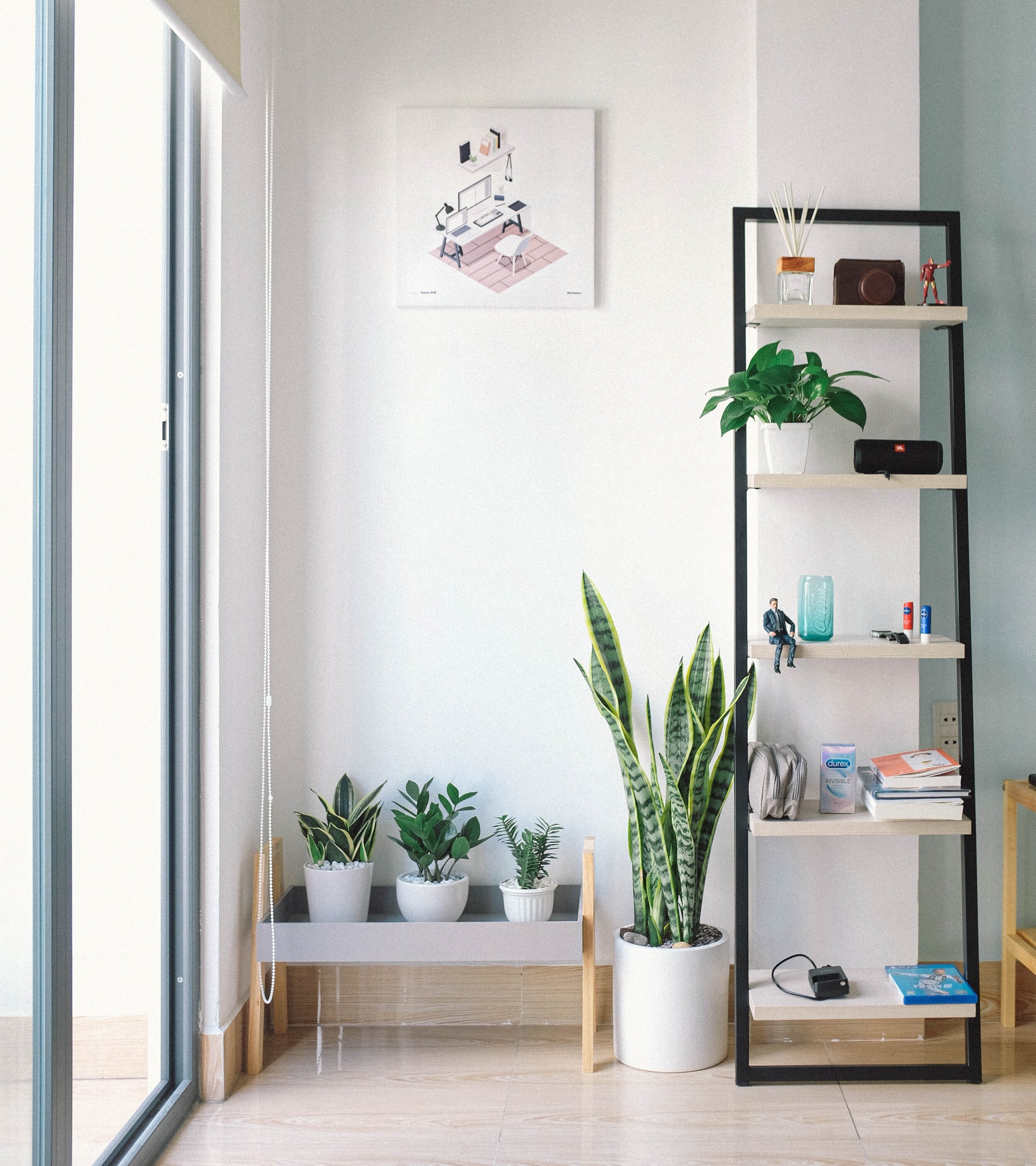
Add fresh flowers and greenery: Bring the outdoors inside by adding fresh flowers and plants to your home. Choose colourful blooms and foliage that complement your decor.

Change your linens: Switch out your heavy winter bedding for lighter fabrics and brighter colours. Replace your flannel sheets with cotton or linen, and add a light quilt or coverlet in a pastel hue.

Declutter: Spring is the perfect time to clear out the clutter in your home. Get rid of anything you no longer need or use, and organize your remaining items in attractive storage containers.

Paint a room: A fresh coat of paint can instantly transform a room. Choose a light, bright colour to make a space feel more open and airy.

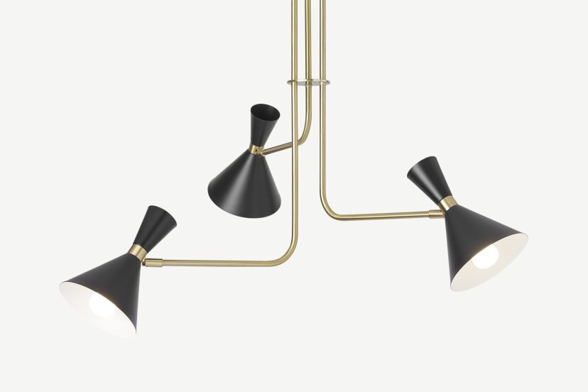
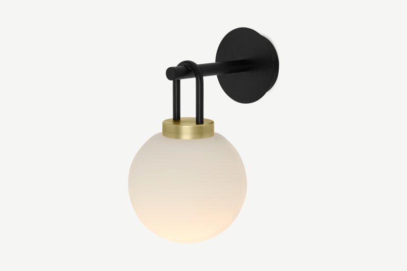
Update your lighting: Swap out your heavy winter lighting for lighter fixtures that let in more natural light. Consider adding some pendant lights or a chandelier for a fresh new look.

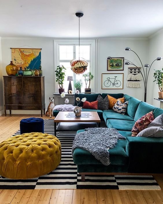
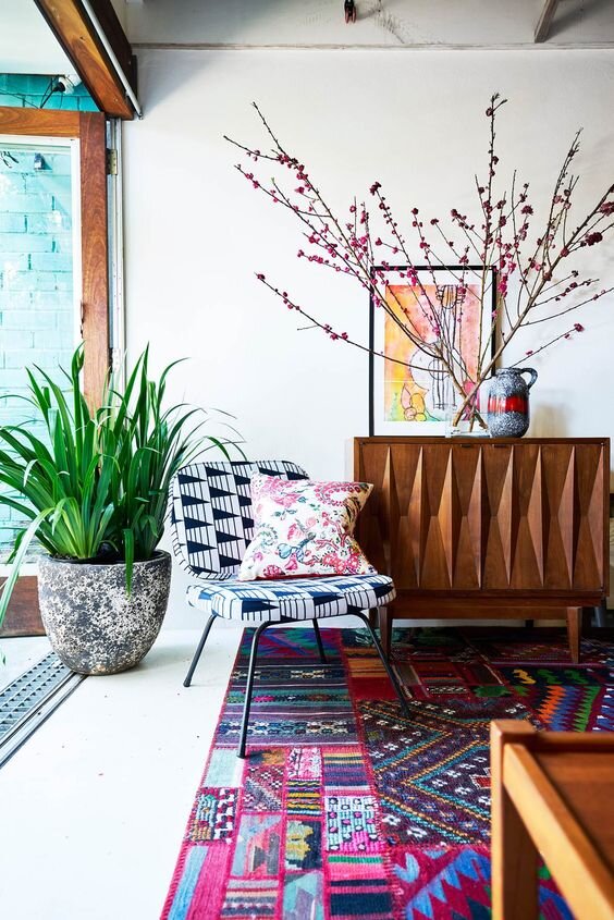
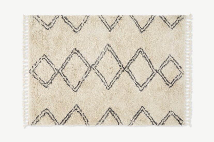
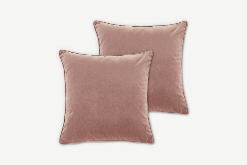
Add some new accessories: Replace your heavy winter accessories with lighter, brighter ones. Consider adding some new throw pillows, a colorful area rug, or a decorative vase or bowl.

Clean your windows: Make the most of the spring sunshine by cleaning your windows inside and out. Use a mixture of warm water and vinegar to get them sparkling clean.

Rearrange your furniture: Give your space a fresh new look by rearranging your furniture. Experiment with different layouts to find the one that works best for you.

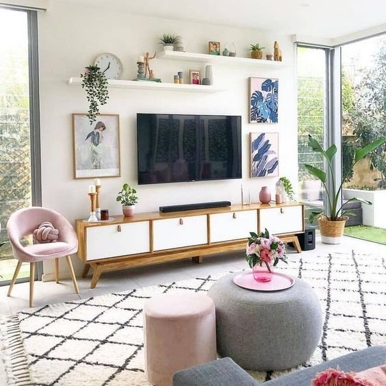
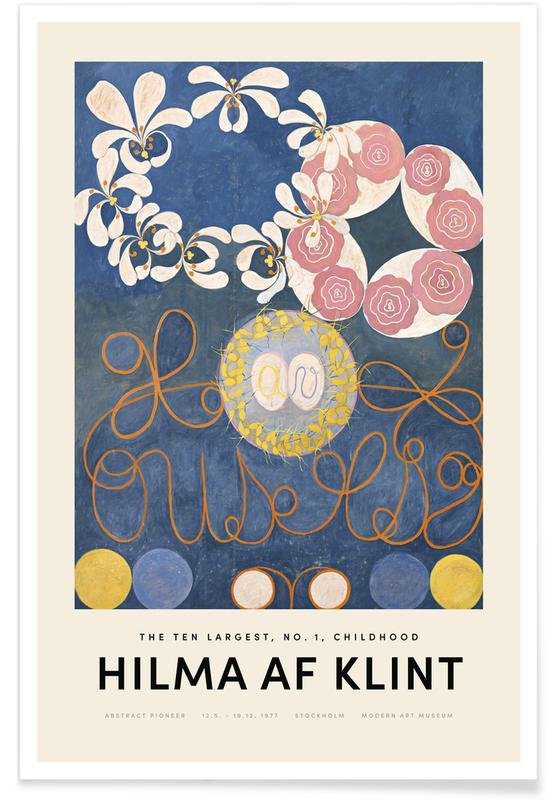
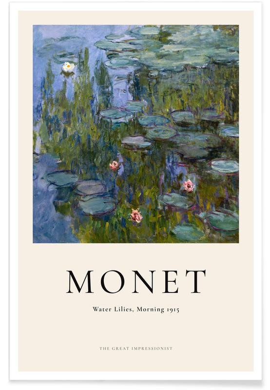
Add some art: Invest in some new artwork to update your walls. Choose pieces that reflect the colours and mood of spring, such as floral prints or abstract landscapes.

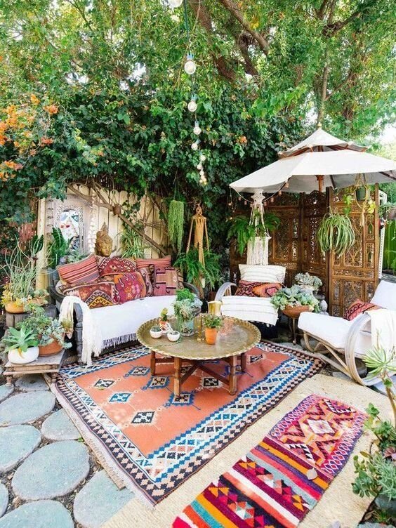
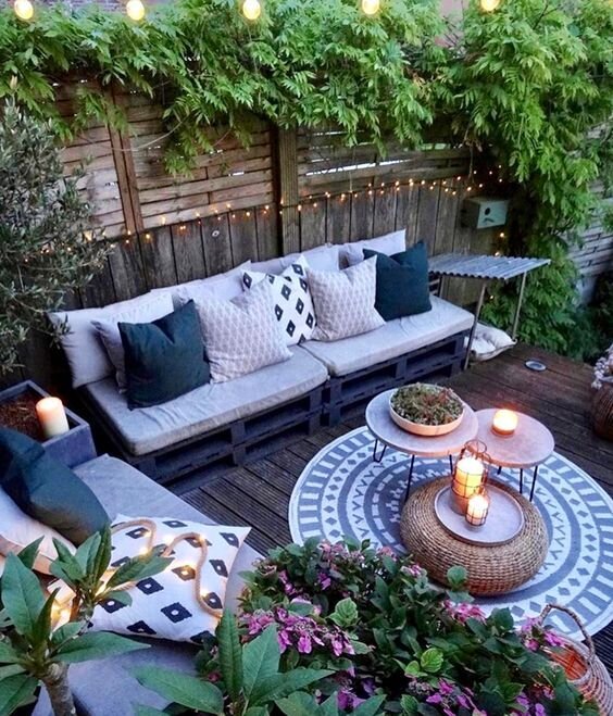
Bring in some outdoor furniture: If you have a patio or balcony, bring in some outdoor furniture to create a cozy outdoor living space. Choose pieces that are lightweight and easy to move around, so you can enjoy the spring weather to the fullest.

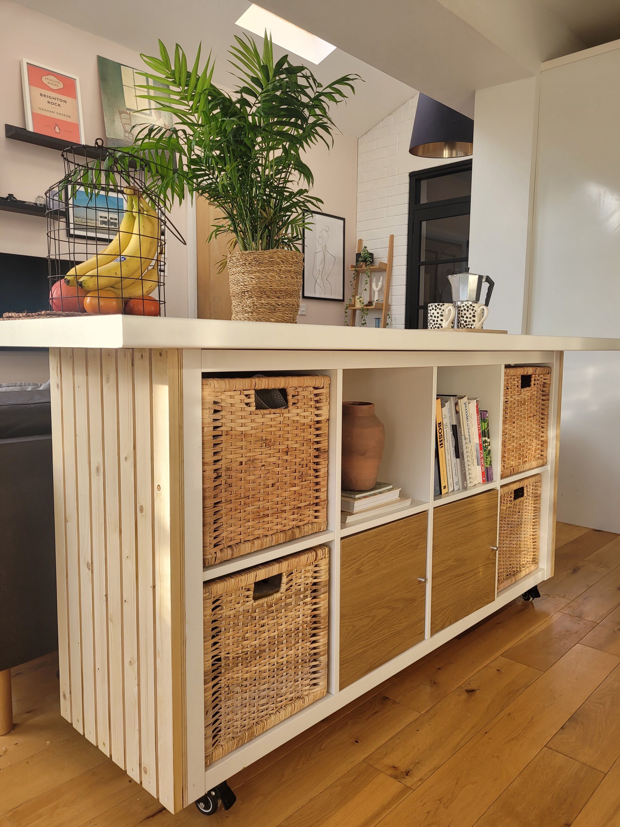
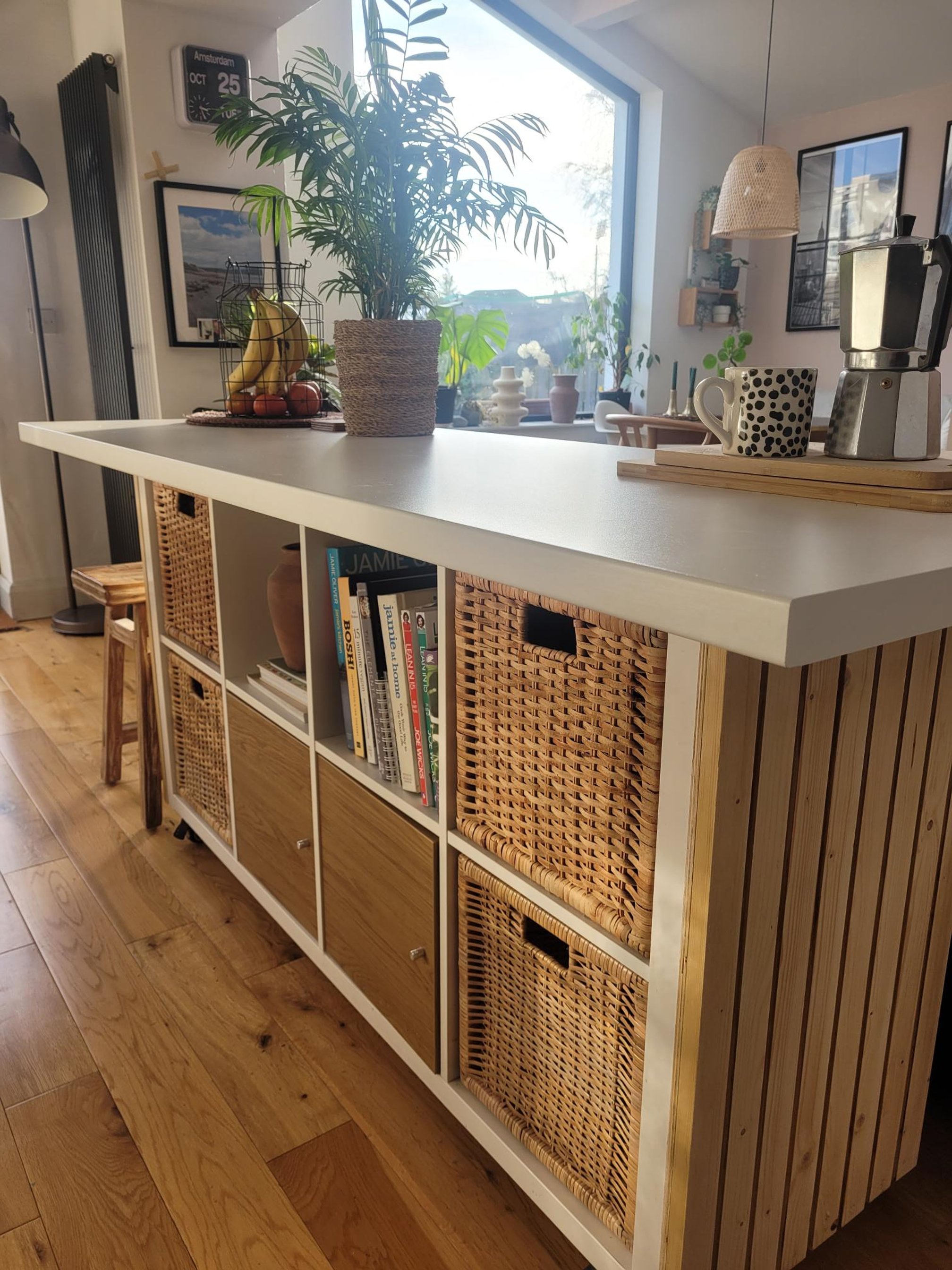
Ikea Hack - Kitchen Island

How to turn an Ikea kallax bookcase into a Kitchen Island


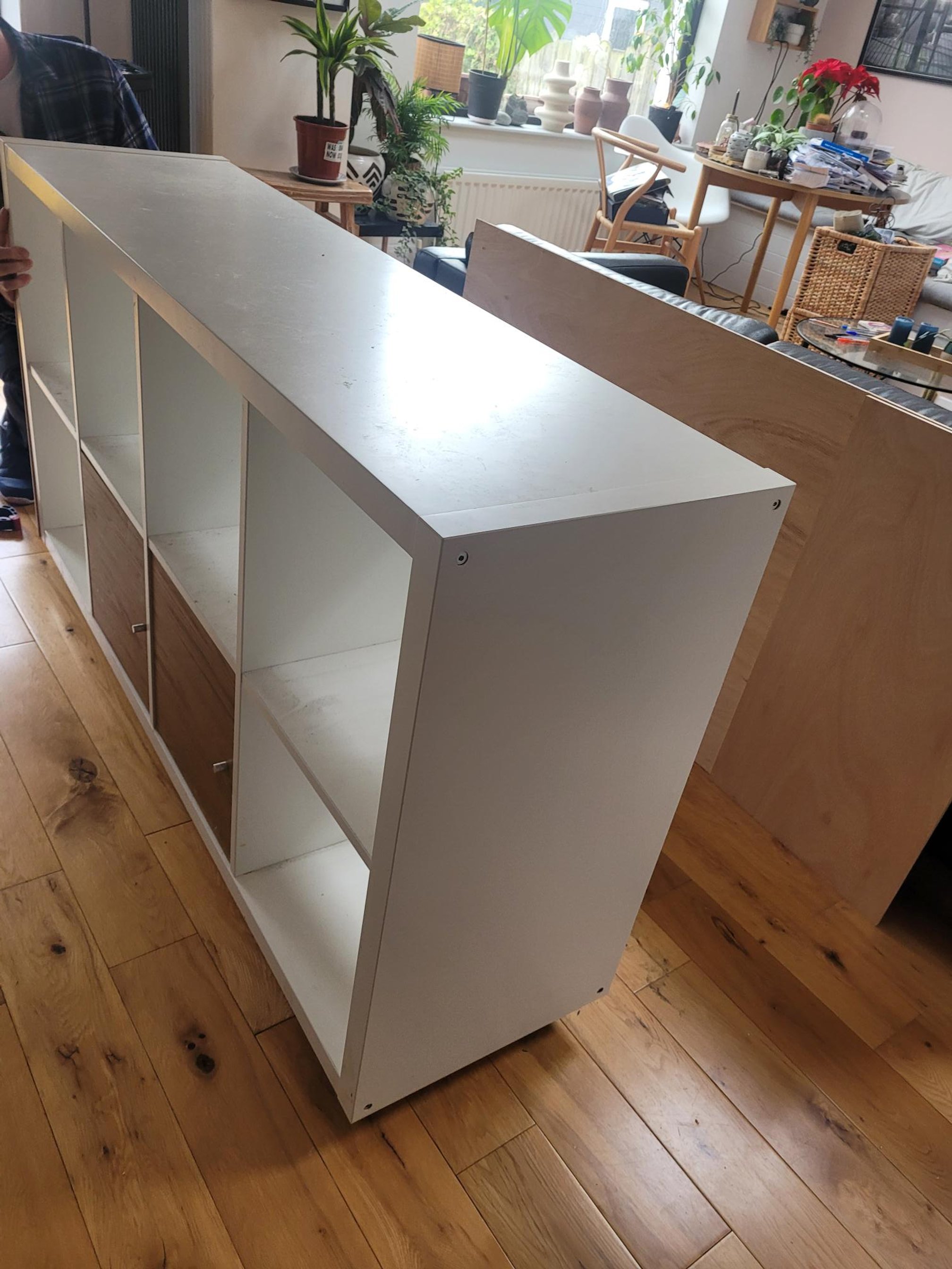
I had an Ikea bookcase dividing my Kitchen area from the Living area. It was where I was going to display all sorts of loveliness but I’ll be honest it became a home for letters, handbag, keys etc… so in other words, a dumping ground. We have always considered the idea for an island in the space but it had to be movable for flexibility, slimline so as not to take up too much room, have useful storage and have enough room to prep food at.

First thing we did was put wheels on the bookcase to give it more height and make it movable.

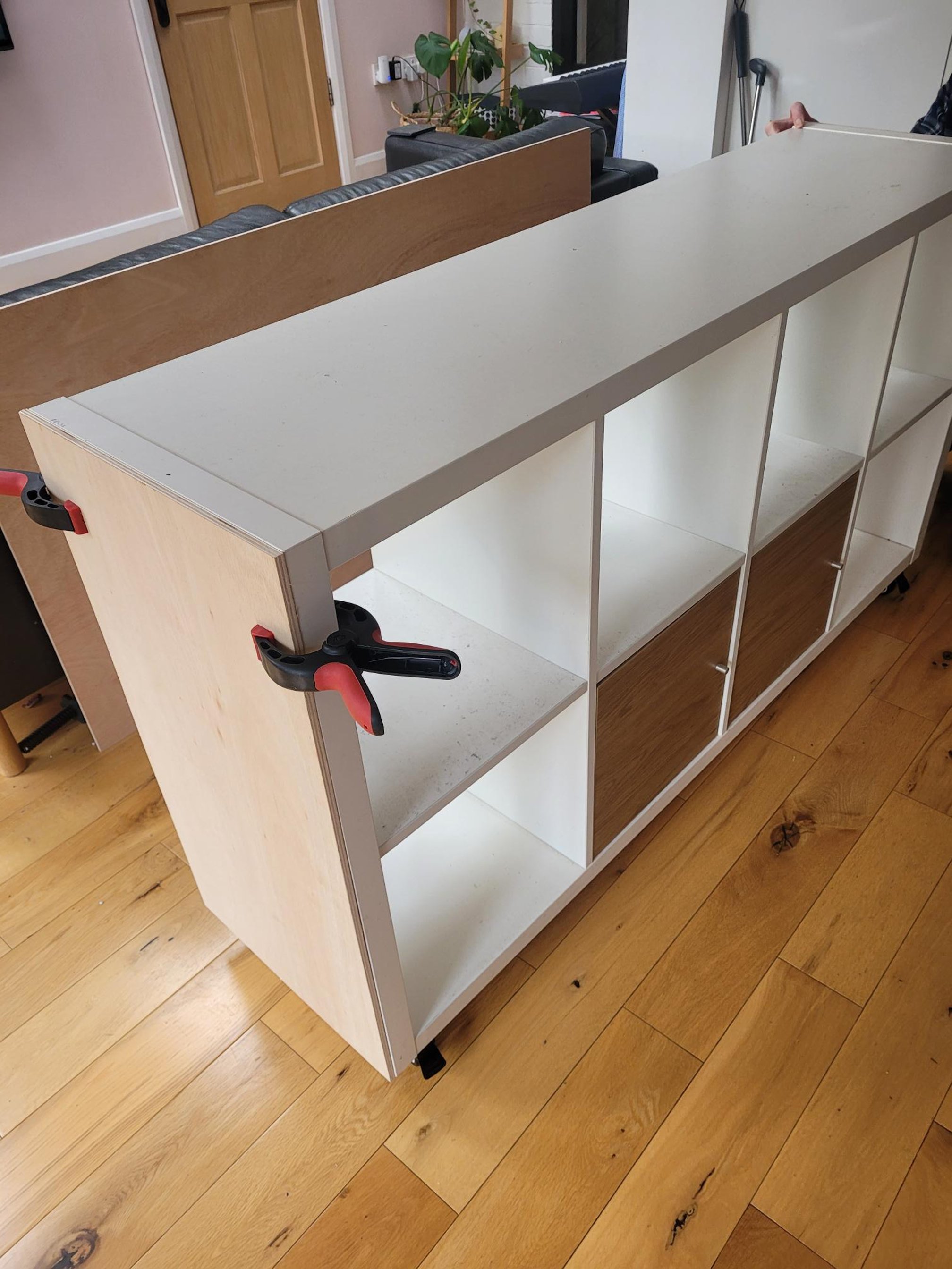
2. Sheets of plywood were cut to size and attached to the back and sides of the bookcase.

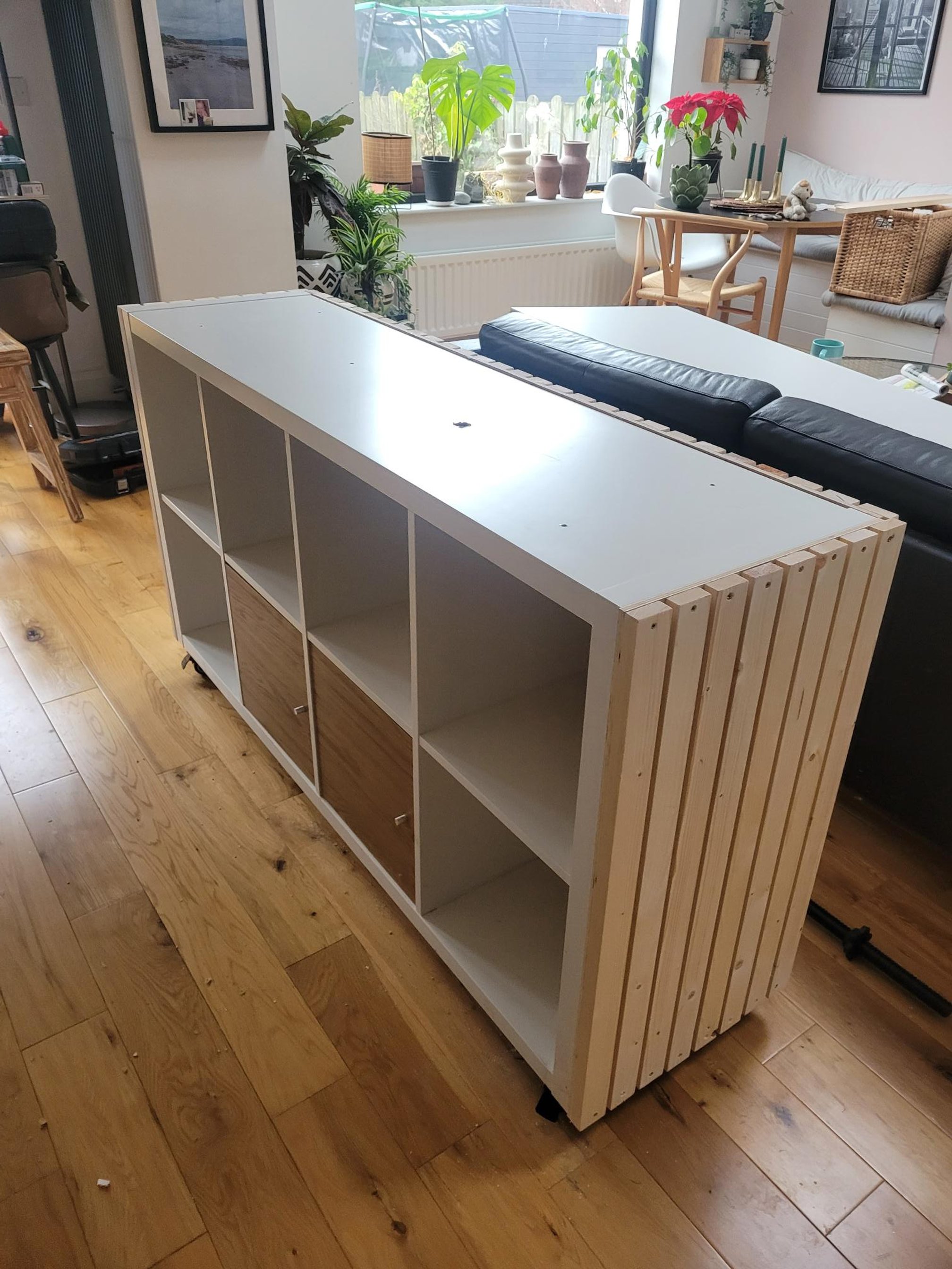
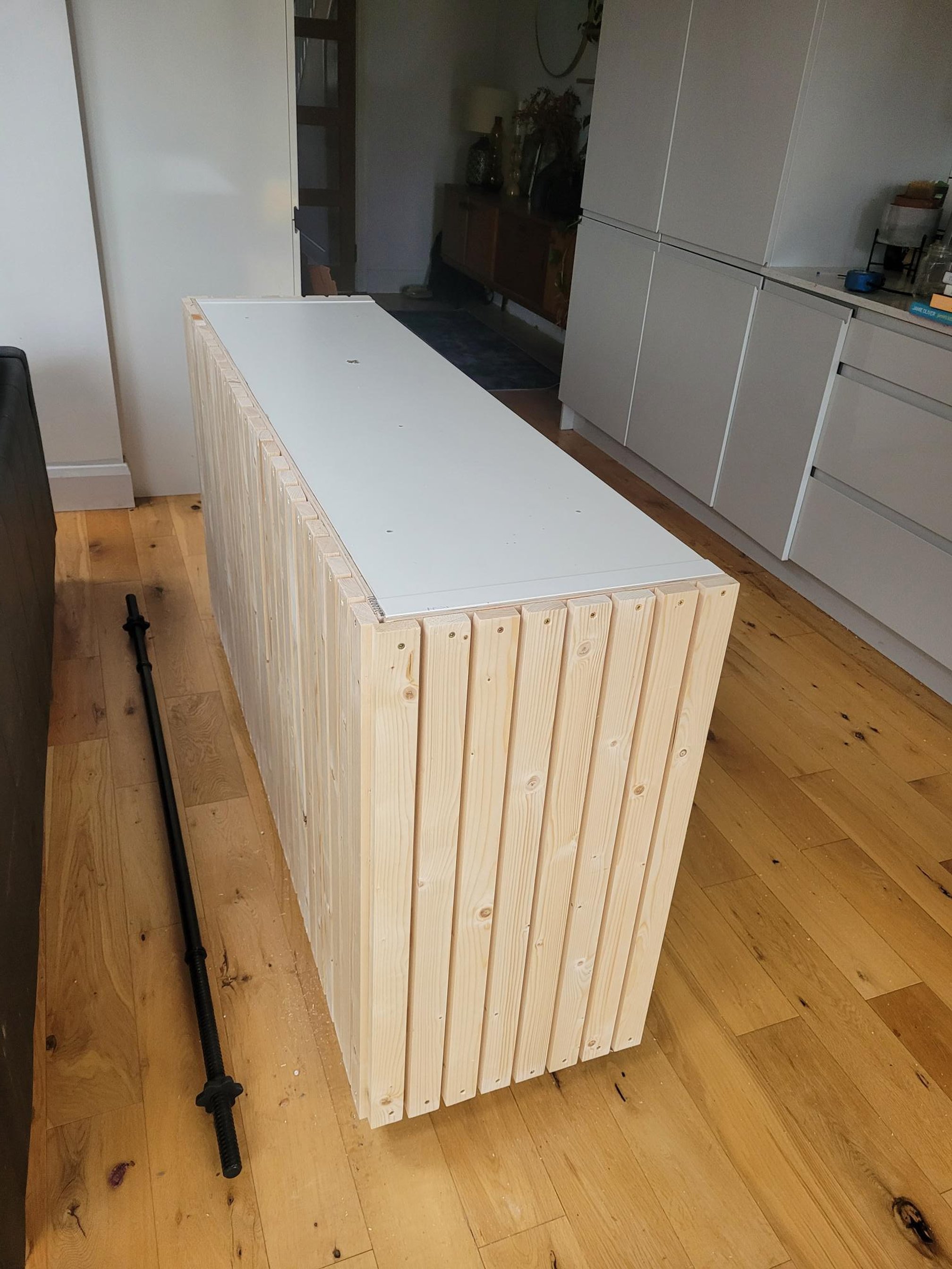
3. Next, pieces of wood were cut to size, evenly spaced and screwed to the plywood.

4. A clear varnish was applied to protect the wood.

Finally, an Ikea worktop was glued to the top of the unit, leaving a wider overhang at one side to enable a space to sit, if necessary. Baskets were added for storage along with the door cupboards already there and hey presto we had an island.

So easy to do and a great way to make an old piece useful.

Colours for a North Facing Room

Image Credit - Pinterest

Choosing the right colour for a north facing room can be a bit tricky, as these rooms tend to receive less natural light and can feel cooler and darker than rooms facing other directions. Here are some tips to help you choose the right colour for a north facing room:

1.     Consider warm colours: Since north facing rooms can feel cool and dark, it can be helpful to choose warm colours such as yellows, oranges, and reds. These colours can add warmth and energy to the room, and can help balance out the lack of natural light.

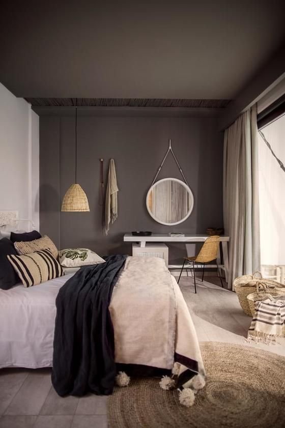
2.     Avoid cool colours: While warm colours can be a good choice, you may want to avoid cool colours such as blues and greens, which can make the room feel even cooler and darker. Sometimes going for a darker colour works too, making it cosy and clam, embracing the lack of light.

3.     Go for lighter shades: Lighter shades of any colour can help brighten up a north facing room and make it feel more spacious. Consider using a light cream, beige, or pale yellow to help reflect the available light.

4.     Use accent colours: If you're hesitant to use a bold colour on the walls, consider using it as an accent instead. Adding colourful pillows, artwork, or curtains can add interest and energy to the room without overwhelming it.

5.     Consider the other colours in the room: Think about the other colours in the room, such as furniture and flooring, when choosing a colour for the walls. You want the colour to complement the existing elements in the room and create a cohesive look.

Remember, the colour you choose for your north facing room will depend on your personal style and preferences. Don't be afraid to experiment with different colours and shades until you find the right one for your space

Styling a Bookcase


Styling a Bookcase

Image credit Pinterest

Styling a bookcase can be a fun and creative way to showcase your favourite books, decorative objects, and personal items. Here are some tips for styling a bookcase:

1.     Start by clearing everything off the bookcase. This will give you a blank canvas to work with and allow you to see the bookcase's true potential.

2.     Sort through your books and decide which ones you want to display. Consider grouping books by color, size, or subject to create a cohesive look.

3.     Use bookends to hold up books vertically or horizontally. This will help break up the rows of books and add visual interest.

4.     Add decorative objects such as framed photos, vases, or sculptures. These objects can add a personal touch and break up the monotony of the books.

5.     Use baskets or bins to store items that don't fit neatly on the shelves, such as magazines or remote controls.

6.     Vary the height of objects on the shelves to create depth and interest. Use taller objects on the top shelf and shorter objects on the lower shelves.

7.     Add some greenery or flowers to add some life and colour to the space. Plants can also help fill any empty spaces and make the bookcase feel more welcoming.

8.     Step back and look at the bookcase as a whole. Make sure there is a good balance of books and decorative objects and that the overall look is cohesive and pleasing to the eye.

Remember, the key to styling a bookcase is to have fun and showcase your personality and style.

New year.....New ideas...what's happening in 2023

New year…New Ideas

It’s that time of year again where we are looking forward to a fresh new year. What’s new or what is old and doing the rounds again in interiors? I’ve had a look at the upcoming interior trends and chosen my favourites.

Image Credit - Pinterest

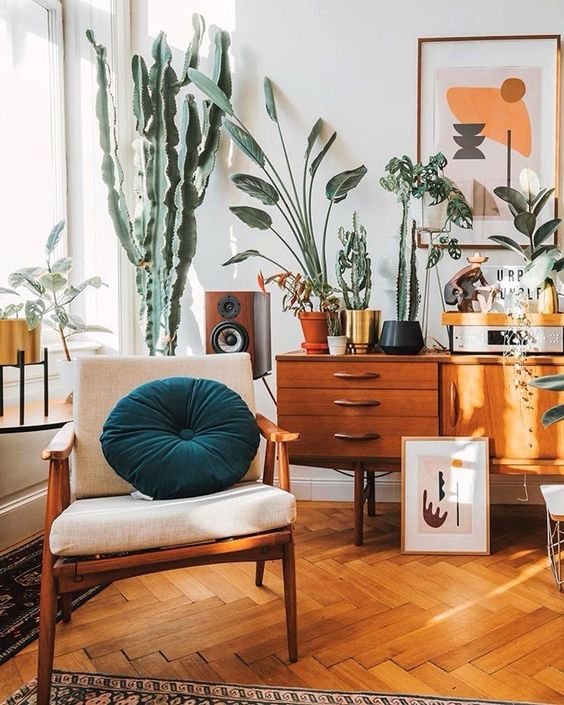
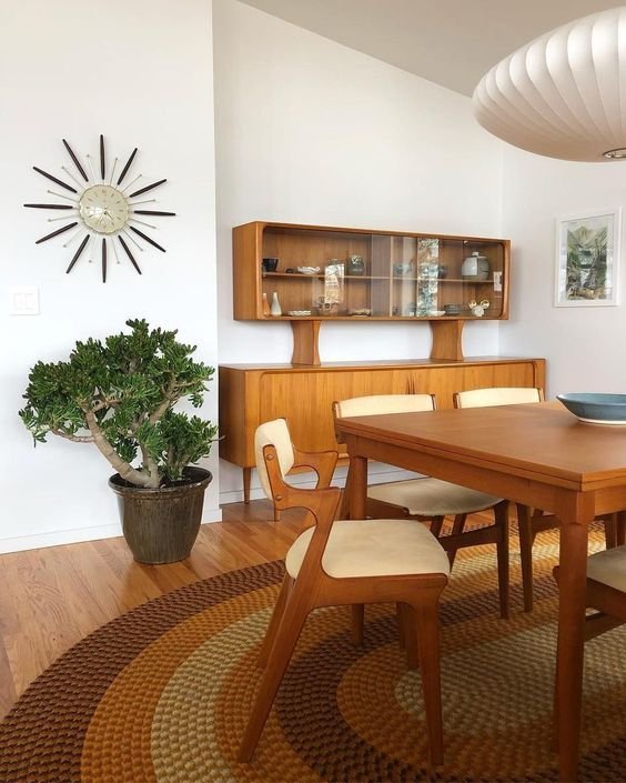
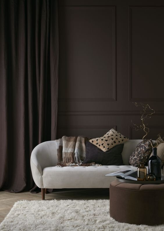
Return to the 70’s …apparently the 70’s are back (again). I love all things 70’s, watch out for browns, red and gold tones spiced with mid century modern furniture. Sink-in sofas for comfort, large table lamps and statement lighting, rattan and wicker furniture. The 70’s are back…again!

Image Credit - Pinterest Style within Grace , Lauree Garvin, Posh Pennies,

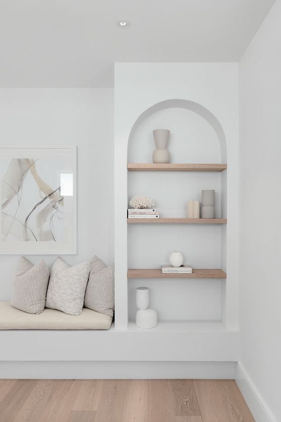
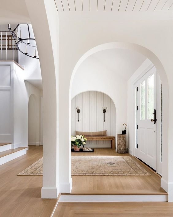
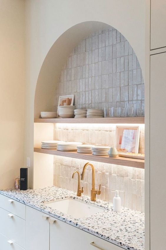
Arches are going to be popular, in the Japandi and Scandi trends. A great way to link rooms but softer than your angled square types. also watch out for arched alcoves, furniture and accessories such as mirrors.

Image Credit - Pinterest: Real Living Magazine, Cool and Organised, Farmhouse living

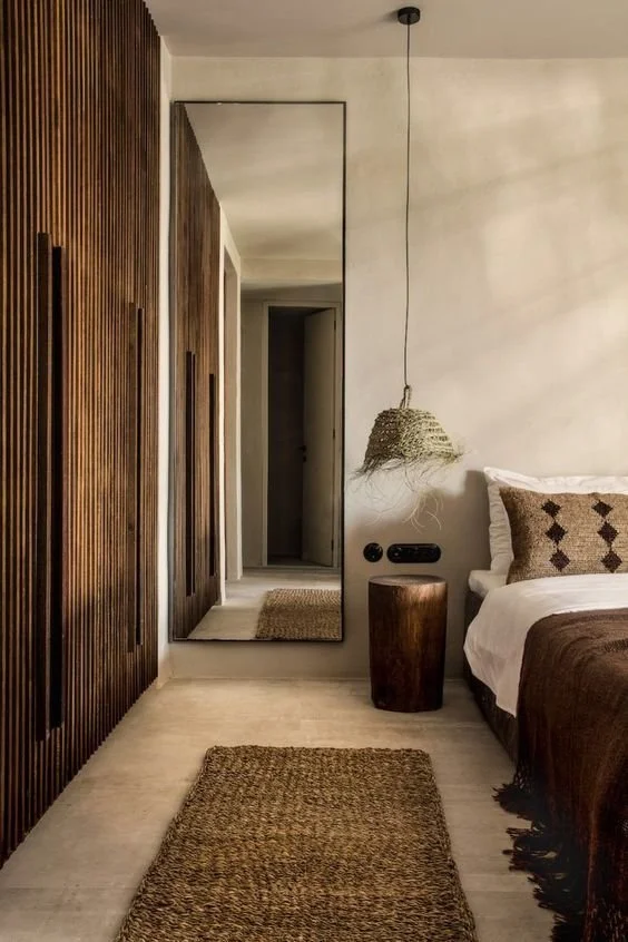
Browns, a bit marmitey, you either like or don’t. I’m in the “like” camp. not a horrible sludgy brown but think, gorgeous chocolately, caramelly, warm colours. The 70’s vibe as mentioned above encorporates brown beautifully through furniture, think walnut or mahoganey and wall colours bringing cosy warmth to our spaces.
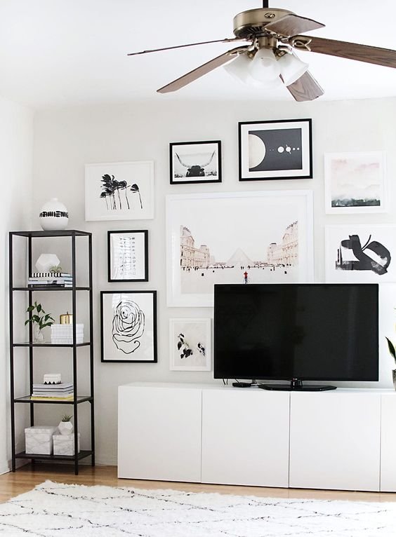
Image Credit Pinterest

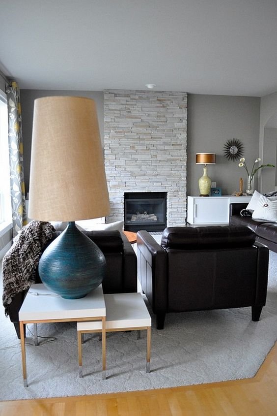
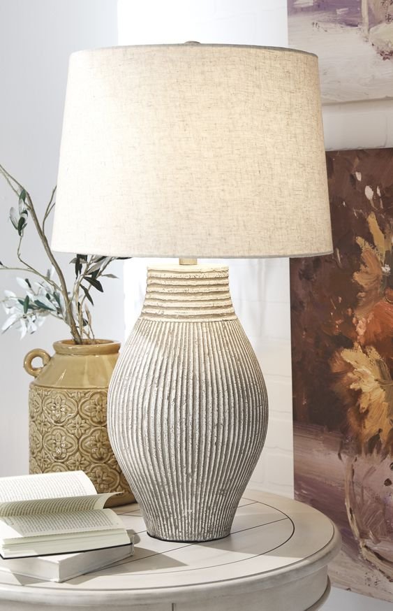
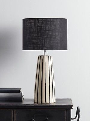
Oversized pendants and statement table lamps. My favourite things! Watch out for stand out pendant and lamp designs.

Image Credit - Pinterest

Images credit - Pinterest

Rug Placement Ideas

Rug Placement Ideas

Different rooms require different size and types of rugs. How you place your rug and the size can really make or break your interior design and what you are trying to achieve. A simple way to update your home giving it warmth and personality. Choose one that complements your design, echoing the colours you have used in the room.

How to Create a Gallery Wall

I wish I could say that creating a gallery wall was easy, peasy. Sometimes it can go very wrong! But if you follow some easy rules, it shouldn’t be too taxing a job. Getting it right can make all the difference to the overall effect of your design. The devil is in the detail. Follow my simple steps to hanging art or mirrors below.

When hanging a single piece above a console or sideboard, make sure it is approximately 152 cm from the floor and should be at least 2/3 of the width of the piece of furniture.

Make your Gallery Wall perfect by having 5-12 cm between frames, vary your layout for a relaxed feel. The centre of your gallery should be at eye level and the distance below and above the frames should be approximately the same.

If you choose to go with the rule of three, with multiple pieces, the overall width should be at least two thirds the width of the furniture below.

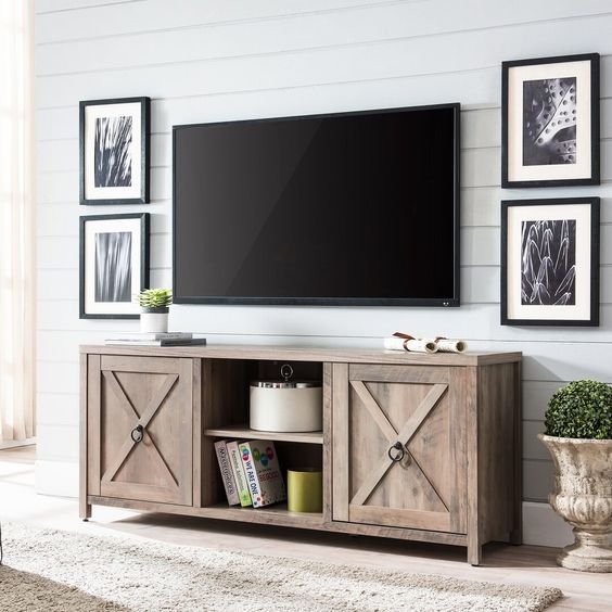
Decorating around the TV

Our TVs are essential to our everyday lives. Even though we use our phones, Ipads etc..to watch our entertainment of choice, we still revert back to the TV to gather around, to watch our favourite shows together. Sometimes though the TV can be a bit of an eyesore so we have to invent ways around making it a more attractive area of our living rooms.

Here are some ideas to make your TV pretty.


Create a gallery wall around your TV

Image via Pinterest Blesserhome

Image via Pinterest Homey oh my

Create a visual below the TV

Image via Pinterest - Ikea

Image via Pinterest - chrislovesjulia.com

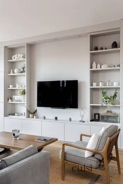
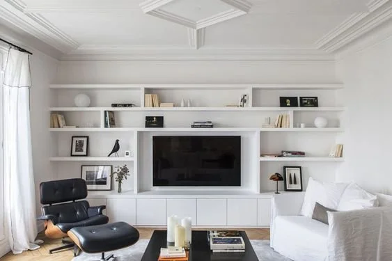
Build built-ins either side and above the TV

Image via Pinterest projet cotemaison

Image via Pinterest desiretoinspire.net

Create balance by positioning prints either side of the TV

Image via Pinterest

Image via Pinterest centsationalstyle.com

Install shelving above the TV

Image via Pinterest - blesserhome.com

Image via Pinterest - motherthrives.com

I love Small Spaces

My design service caters, for those of us, who are just lucky enough to live in a more bijou space. Why do I like helping people with small spaces, achieve big ideas for their homes? Well, I live in one!

Small spaces can be just as lovely as big ones.

6 handy hints for making your small home...ENORMOUS…

  1. Sorry, but hate to say it…declutter your clutter. Making space in your home is a great way to get new space. Get rid of all the stuff you don’t truly love or find useful. Donate or sell items past their sell by date.

  2. Lower your furniture. The lower the furniture, the more space above. Choose furniture with legs so you can see the floor underneath. This gives the impression of more space.

  3. Glass furniture. try a glass topped coffee table with storage underneath for pretty items. visually appealing and gives the illusion of space rather than having a solid top.

  4. Clever storage for the things you haven’t decluttered. try pretty baskets, built in, floor to ceiling shelves.

  5. Use lots of mirrors, an oldie but a good one. Mirrors reflect light around your space and take your eyeline to other parts of your home.

  6. Go big with your Art. One large piece instead of lots of little ones. Hang at eye level so there is space above and around the piece.

Some shopping Ideas for your small space below

Dreams Sofa Bed

Dunelm Mill Darwin Velvet 3 seater

Wayfair Anissa Coffee table with storage

Dunelm Curva Gold Wall Mirror

Junique

On My Radar: 5 Great Sofas for your Living Room

Sofa Loves…

Save yourself the bother of hunting for the perfect sofa and let me do the work!. Perch yourself on one of these beauties for under £1000. A sofa needs to last a few years and withstand all the interiors fashion fads.

Think about the following tips:

Choose…

1 Simple shape. keep the shape simple so you don’t go off it too quickly.

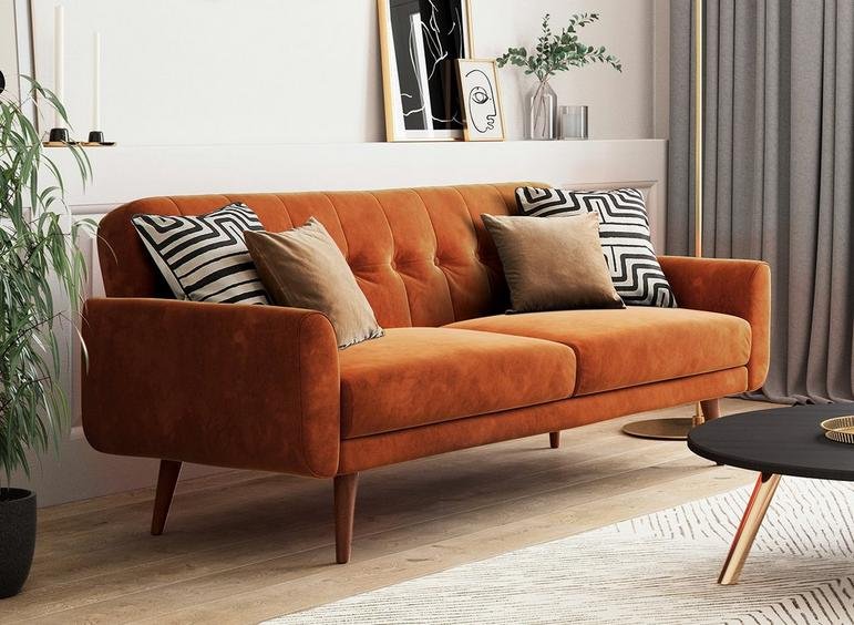
2. Choose a neutral colour that can complement lots of colour schemes, easier to paint the walls and buy cushion updates than purchase a new sofa. Ok, one of these is orange…but couldn’t resist!

3. Don’t buy too small or too big for your space. Measure up before you go.

4. Check reviews, if buying online and it’s not possible to go to a showroom.

5. Get it Scotch Guarded to prevent spills and stains….boring, I know, but better safe than sorry

6. Stretch yourself and buy the most expensive one for your budget…without going into debt !

7. Check it fits through doorways and passages.

8. If buying online, get a sample of your chosen fabric sent to you, to make sure its the right colour.

Click the images to shop the sofas….Enjoy

Made.com: The Orson in green velvet £849

Made.com: The Orson in green velvet £849

Made.com: The Trudy in Oatmeal £549

Made.com: The Trudy in Oatmeal £549

Housecosy: The Duke in Hounds tooth black £999

Housecosy: The Duke in Hounds tooth black £999

Dfs: The Java in orange velvet £899

Dfs: The Java in orange velvet £899

Dunelm: The Aubrey Chesterfield £769

Dunelm: The Aubrey Chesterfield £769

E Design: The Process

E design: The process

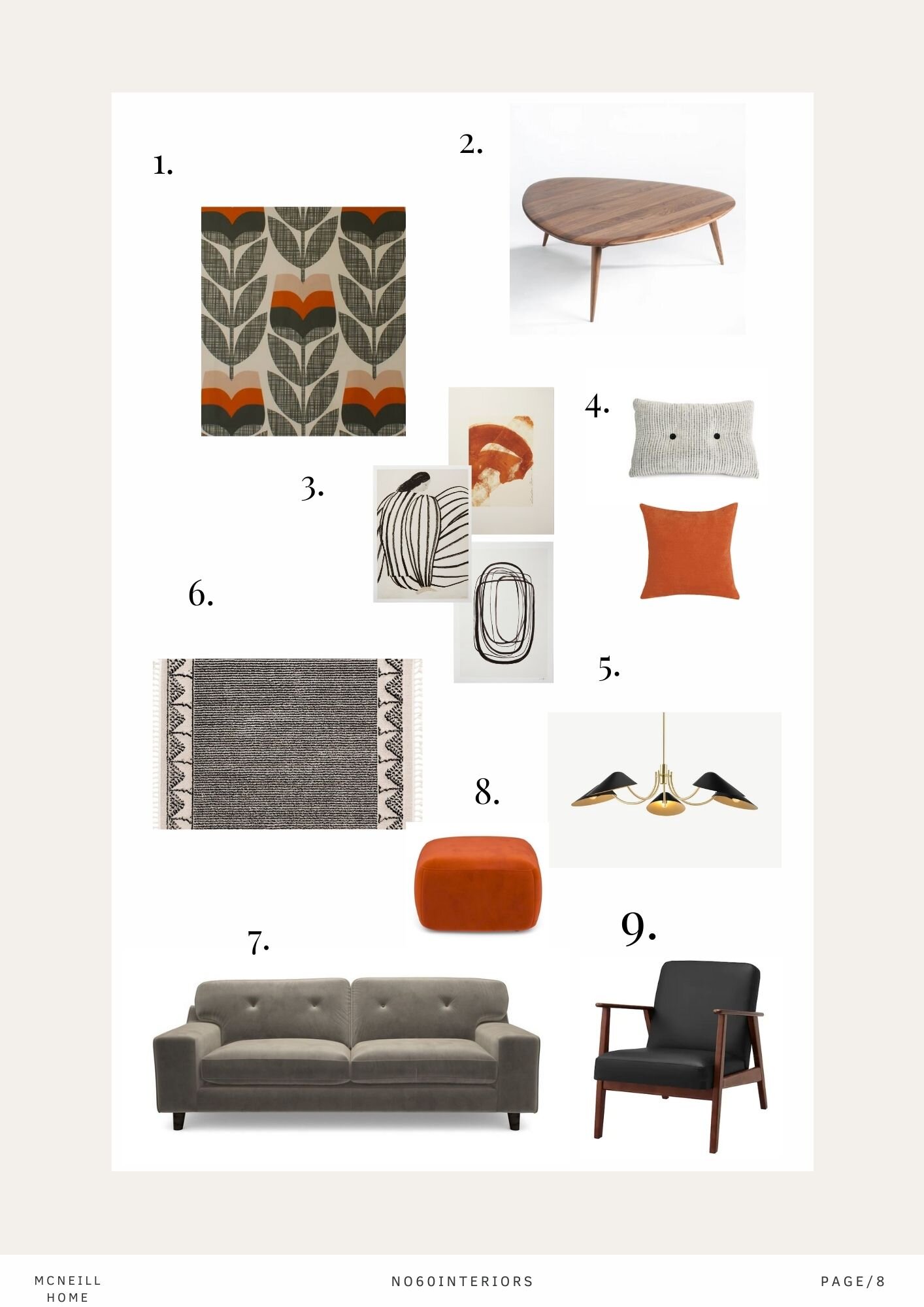
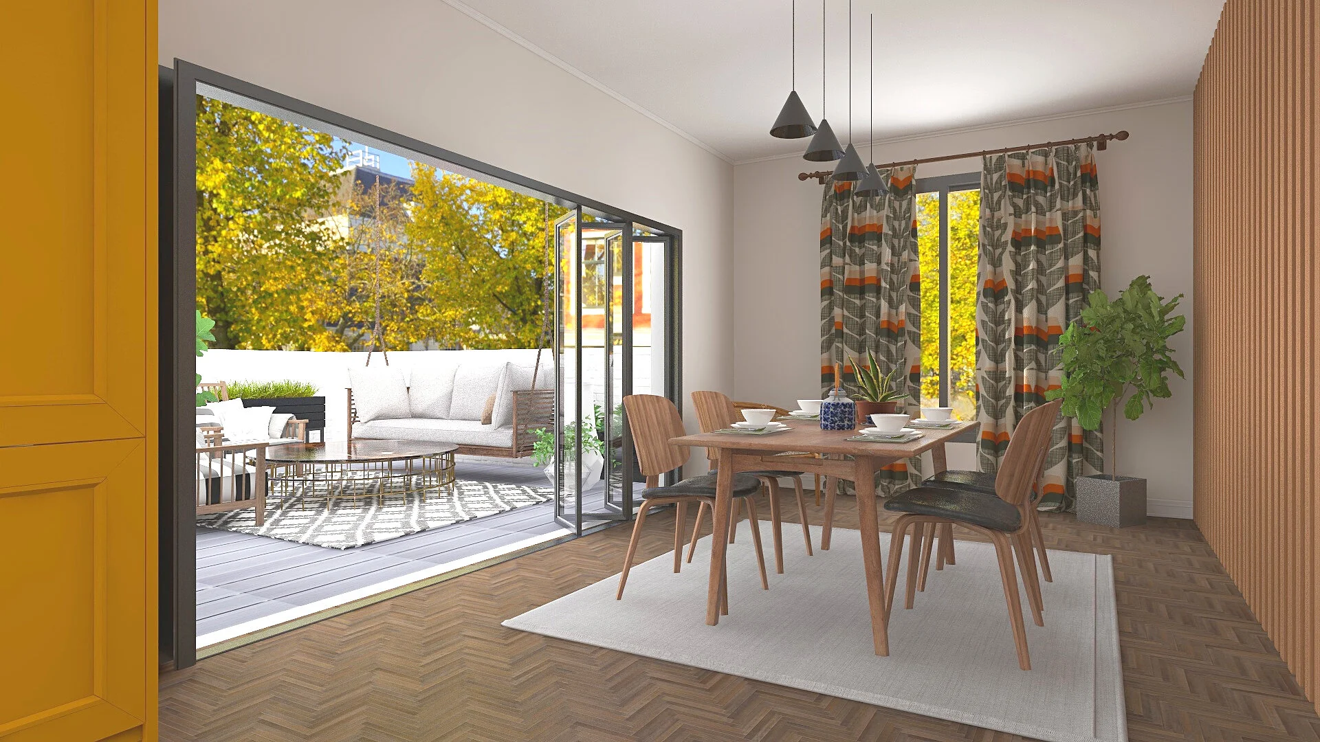
Sometimes you may need a combination of services. the below presentation was for a family home comprising of a living room design concept and 3 d visualisation for a green kitchen and dining area opening up onto a decked area. The brief was bright and colourful with a touch of vintage.

3d floorplan

3d floorplan

2d floorplan

2d floorplan

Design Selections

Design Selections

Design Concept

Design Concept

3d render

3d render

3d visualisation of dining area and kitchen

3d visualisation of dining area and kitchen

3d visualisation of kitchen

3d visualisation of kitchen

3d visualisation of dining and outside decked area.

3d visualisation of dining and outside decked area.

Shop the look

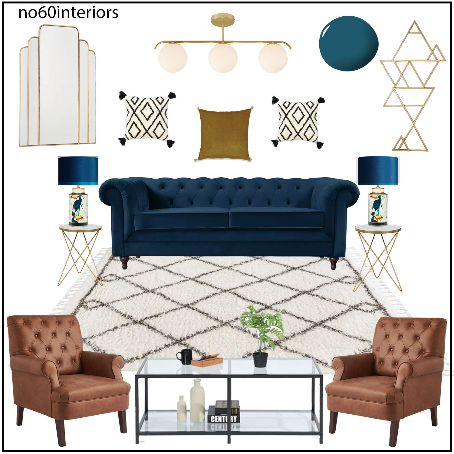
For you lovely readers, a free shop the look board. This living room scheme is one of comfort, colour and a little bit of glam. Perfect for a new living room update! Just click the links below. Enjoy x Roisin

Copy of Copy of Design Presentation Template (4).jpg


heather living room.jpg

Five Interior Trends 2021

My Favourite 2021 Interior Design Trends

So, the new year always brings new interior trends, some I love…some not so much! I’ve condensed some of my favourite interior trends for the coming year…

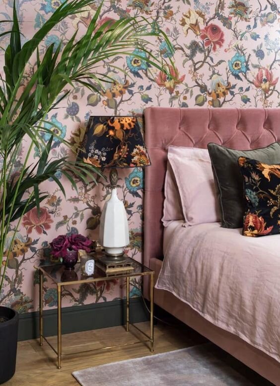
Grandmillennial or a fancy word for granny chic, will be something to watch out for. A gorgeous style basically dressing your house like you granny’s house…sort of! Think large scale, old-fashioned wallpaper, lace tablecloths, velvet, clashing prints and tassled lampshades. Keep it fresh and modern by incorporating contemporary or mid century furniture.

Image Credit - Pinterest

Dried flowers and Cotton

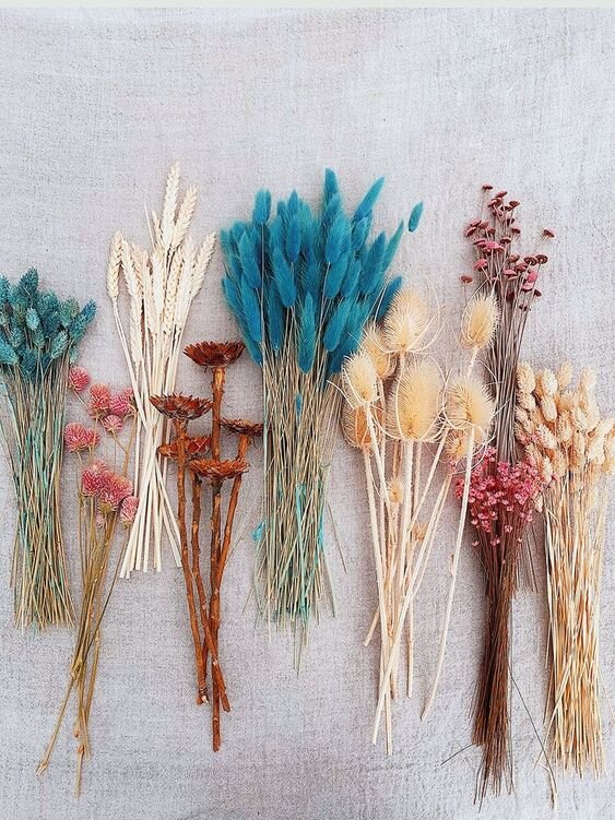
An easy update and cost effective, dried flowers are a beautiful addition to your home. They come in a variety of colours and types…also they last forever….or at least until the trend is over

Boucle

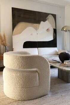
Soft, tactile material that you normally see on your winter coat will be on your sofa instead. So… watch out for this. Maybe a gorgeous boucle sofa or chair loaded up with lots of cushions ready for your next Netflix series.

Image credit - Pinterest

Home offices and Outside spaces

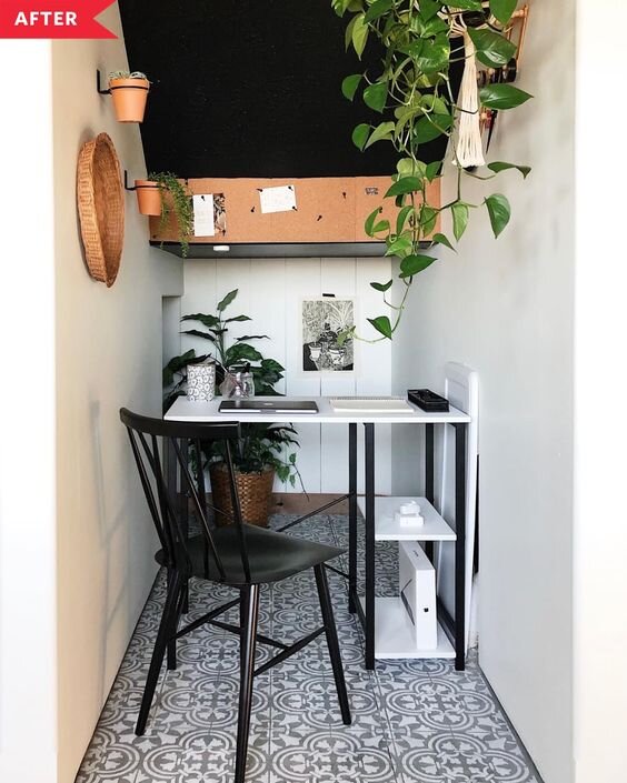
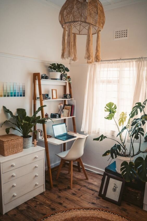
Obviously social distancing will unfortunately still be with us for a while, so home offices and sociable outdoor spaces are still going to be in the interior’s beeline.  Not much room for a separate office? Find a space anywhere in your home you could dedicate to one, incorporate a desk, storage, some lovely prints to look at and some plants for a bit of greenery for some earthy outside-in touches.

All you need for outdoor spaces is a sofa, waterproof mats, plenty of squishy cushions and a parasol to keep off the eventual rain and more optimistically…the sun!

Image credit - Pinterest

Vintage

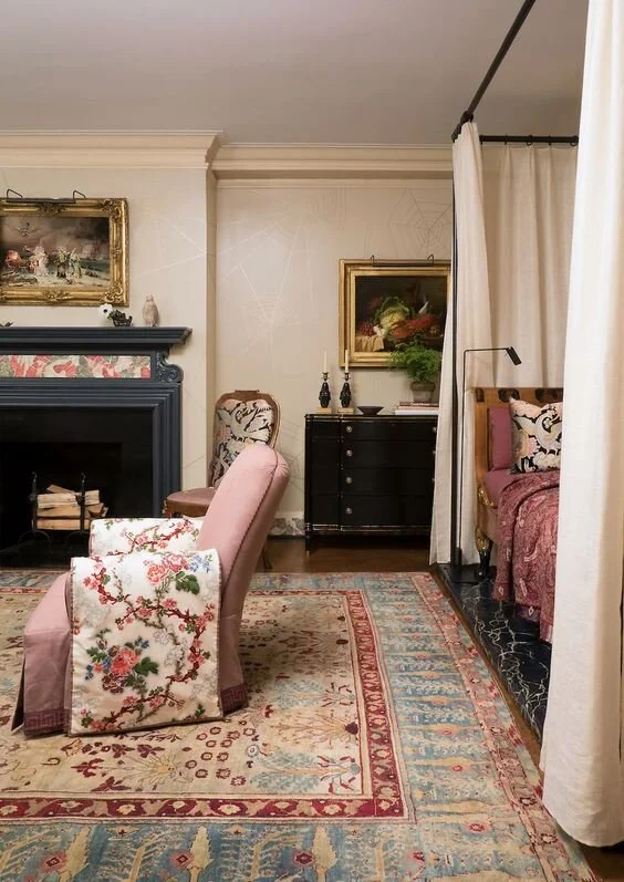
My favourite. Vintage in my eyes rarely goes away. Good quality pieces will always add beauty and sophistication to your scheme. Use your treasured vintage pieces alongside your modern furniture. Mix and match and add some statement lighting for fun. It’s so easy to update a sideboard with a modern lamp or painting.

Image credit - Pinterest

Free Bedroom Design

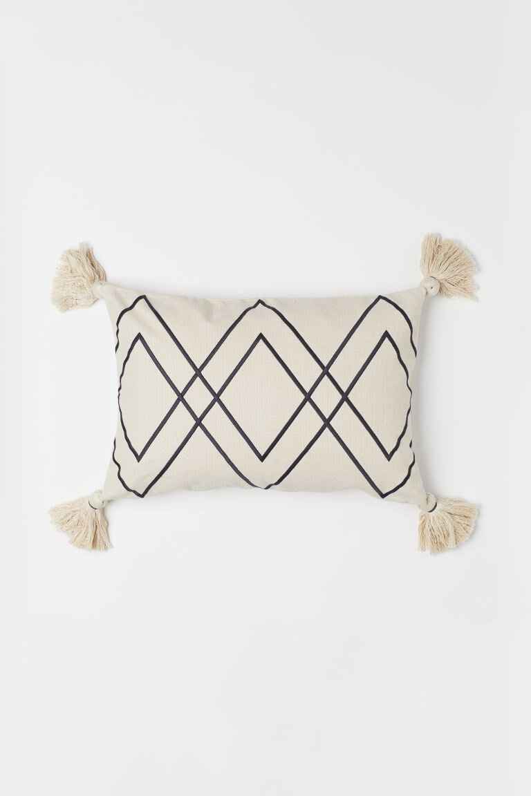
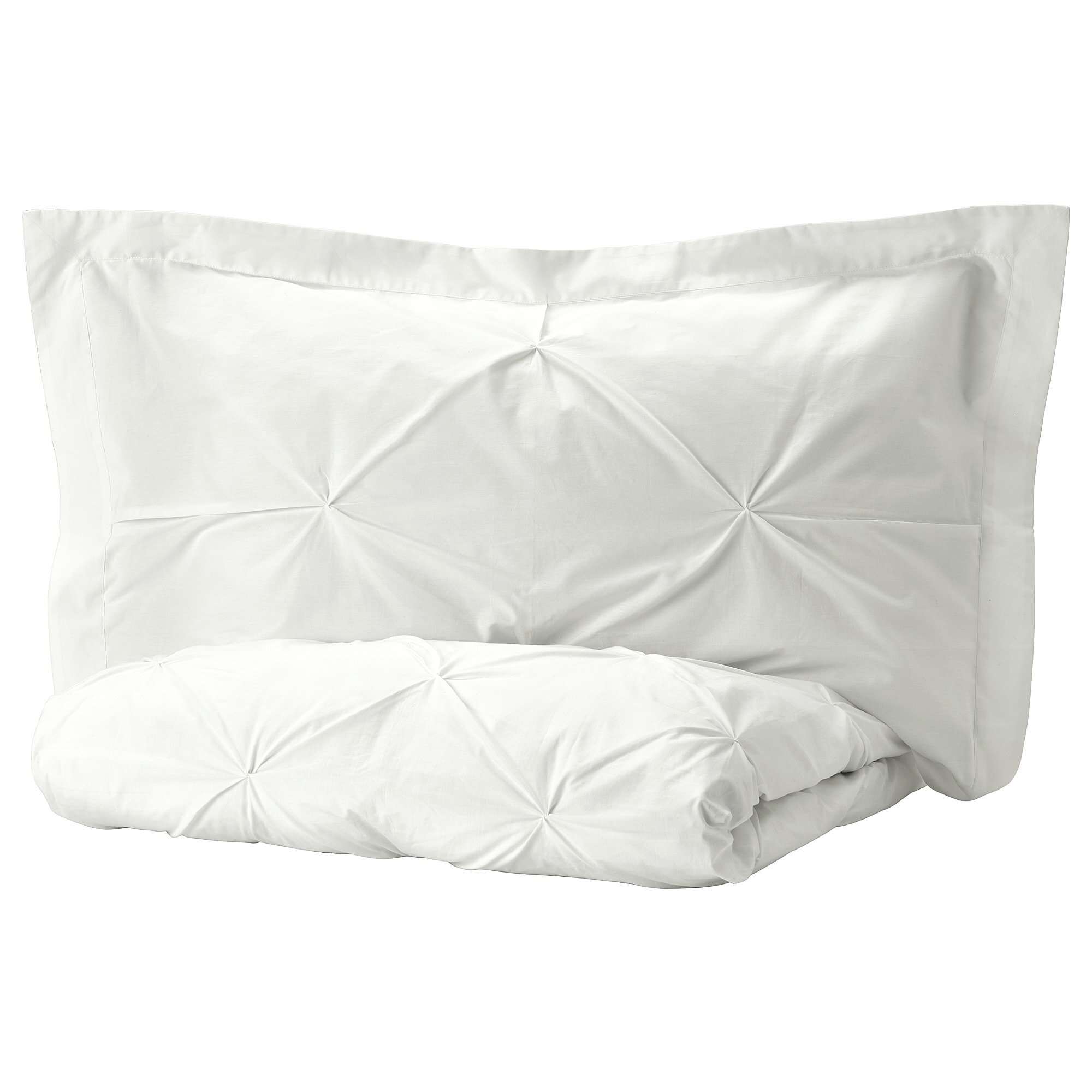
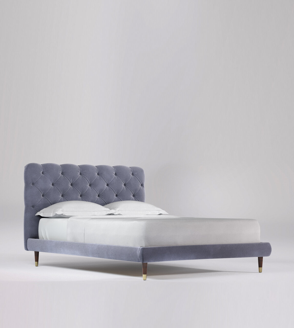
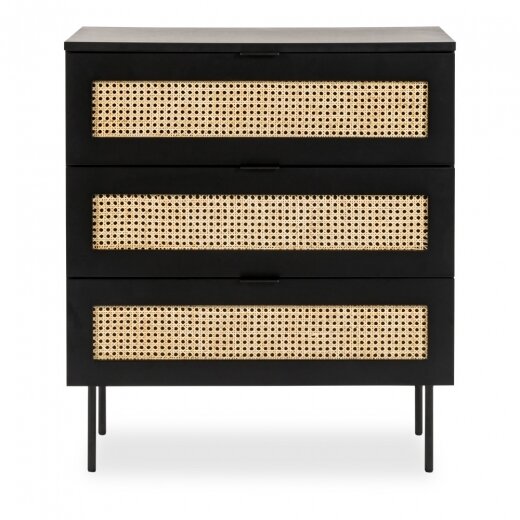
Just for you….a free bedroom design. Sometimes it’s hard to know what to do with a room. So, take the thinking and stressing out of how to design that spare bedroom! Based around a gorgeous blue / grey buttoned bed, white bed linen, black and brass lighting, rattan and dark wood chest of drawers and pops of pink. Set against a backdrop of Farrow and Ball, Pitch Blue. A fresh, glamorous, grown up scheme to run away and hide to. Click on picture links below to take you to each site.


Free bedroom design black light.jpg

Tips to help those awkward shelves

Awkward living room shelves?

You are not alone, I have those. They can be tricky to dress.

Here are some ideas to incorporate

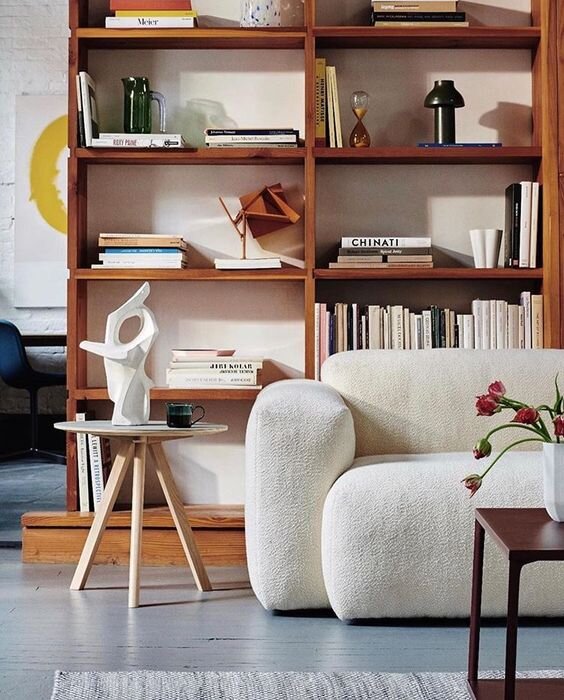
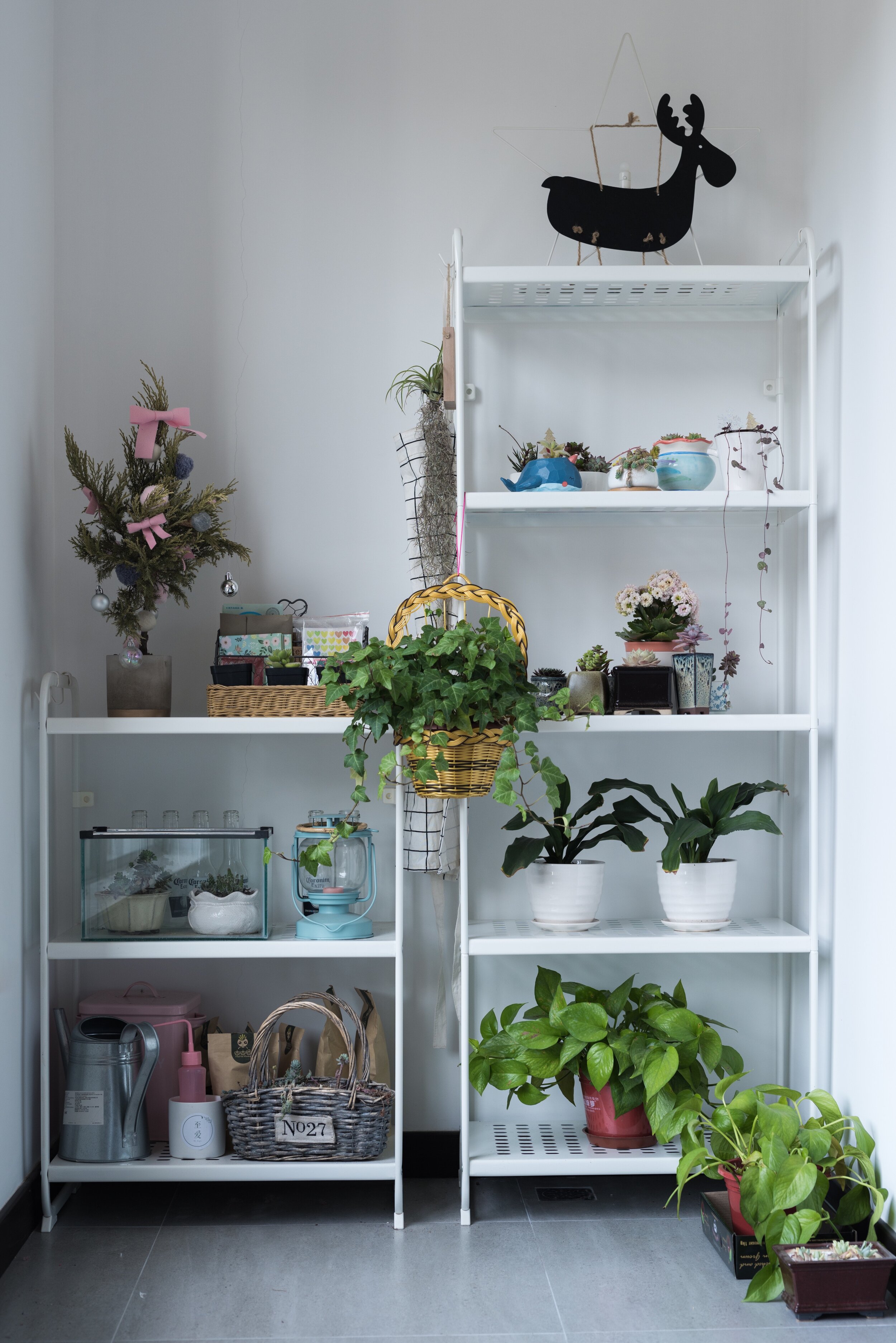
Books and magazines… Stack them horizontally or vertically, make a display around and on top of them, instead of just stacking them all beside each other, effortless styling! You could create a colour story with your books that fit with your room palette

Add some lighting, you can reach! No point if it’s too high. The lighting will create shapes and bring atmosphere to your scene.

Personal items, some family pics, but not too many (in my humble opinion), save the rest for your private upstairs space. Tell stories with treasured items you have pick up along the way of life.

Don’t forget some greenery, faux or real, adds colour and texture

Art casually leaning against the wall can look great

Don’t forget to add some plants to the surrounding area, think about their placement when dressing the shelves, make them part of the scene.

Brave Ground or Not?

Brave Ground is Dulux colour of the year. I have read lots of contrasting opinions about this neutral tone, some for it, some against. I love colour as you can tell from my designs but I am also a fan of the neutral and this beautiful colour. I confess, I have a lot of neutral around my own home! Many may say “too bland” but I say calming and earthy. When painting my space or choosing for a client, I always think, how long can I / they live with this colour? You need to be able to live easily with a colour, maybe for a while (unless you are a serial sprucer upper!)  Dress this lovely neutral up with some rich jewel tones for contrast, as in this sofa, in my design below, using Brave Ground as a back drop.  Bring in other tones of this earthy colour to tie up the scheme, pops of earthy greens in the prints will be a great contrast against this colour. I’m sticking with it until proven wrong! Need help to perk up your neutrals? Click below for a chat.
Bravee ground board.jpg