Choosing the right colour through E design

One of the things that online interior design can help you with, is that all important decision of wall colour. Yes,I always recommend painting a little of your colour choices on your walls or on A4 pieces of paper to see the colour in different lights throughout the day but through online design, your designer (me!) can uses different colour palettes within your virtual space to see which one suits.

Colour can be the central point to entirely changing the mood in your space. It is far from meaningless. Every time you see anything, you see it in you guessed it…colour!

You can create or reduce the perception of space with colour. A space can be opened up by painting a back wall or a ceiling in a lighter or soft colour. You can make a space more cozy and informal, bringing walls forward,using bright or dark colours.

By analyzing how to layer the use of colour and find patterns that you find pleasing, you will achieve a sense of balance in your scheme and also balance for the entire space including all of its other features. Remember, you don’t always have to stick with white. The furniture does not have to be grey! You can have pink walls, white furniture, and blue upholstery. There are endless ways to play with the balance to achieve your favourite combo.

With online interior design you can explore different colour choices. The same space can feel and look completely different depending on your chosen colour combinations. Throw that white out the window! Click below for more info.

When it's rude to call a shed a shed

20200824_154642_resized.jpg

When its rude to call a shed...a shed

Like the rest of the world Lockdown brought about many home transformations and that included me! The seeds for the lockdown project started when we redesigned one half of the garden and needed something to look at on the other side. So the shed idea / garden room / summer house… began to  take shape.  Something compact and bijou as the garden is not too big. My idea was to get one of those shed kits but my husband who is quite creative decided to take the job on himself, with the help of someone who really knew what he was doing! That person has been somewhat sidelined in the story of how the She Shed came to fruition!

Do not under estimate the amount of work involved with creating even such a small space.  I wanted something that could be used most of the year round and with the beautiful Irish weather we needed something that was, warm but sturdy to withstand the wild and wet days we get.

Once it was completed the fun began, after what felt like 10 coats of white paints, lots of sanding, more paint for the cladding and the outside, a bit more sanding…I could properly decorate.  I had a few ideas, restful colours, comfy cushions a few accessories and as it’s a space for my daughter also, I took her ideas into account too.  Pastels were the colours she wanted but in order to not make it feel too pink and yellow, I incorporated the pastel theme through cushions and accessories. Starting with a concept design board, I knew I wanted rattan chairs, a coffee table, a couple of shelves and space for some prints. Now that the painting pain has faded and we have christened it with champagne we need to give it a name….She Shed, Garden Room, Garden Shed or just plain old The shed… Chairs are from La redoute, table is Ikea,prints are a selection from Juicy home and pink and blue cushions are Ikea.

One corner.... 5 looks

All Art prints blog 1.jpg

One corner…5 different looks…Art inspiring

Today, let’s talk about Art.  Art is the one thing I feel is so subjective and can create arguments galore in my house. What my husband likes, I don’t and vice versa.  I normally get my way (of course!) but it is one area where I do ask for his opinion.

The thing with art is how many is too many.  Gallery walls are great if you have the time and energy to create one and get it all looking straight and co-ordinated. I personally prefer a ‘less is more’ vibe.  One, two or three (sometimes 4) is my motto.  The usual interior design rule of odd numbers 3, 5 , 7 etc is what we mostly go by but I like to break the rules and like pairs of art work or just one large piece all on its lonely only. Although, talking of rules, here are some you should remember

Don't hang the artwork too high, you don’t want to be looking up or looking down at your central piece. Too high and you may make your room feel claustrophobic.

The centre point of your main art work should be at eye level, keep this level throughout your home for consistency.

Don't hang pieces too far apart from each other, approximately two inches on either side, below and above is enough space.

Make sure your pieces are visually balanced, so don’t have the big pieces together and all the small pieces together. Mix things up a bit.

Keep uniformity through the same type of frame or same finish.

Hang four smaller pieces if you don’t have one large piece or one large piece of art work and two smaller ones either side.

Top Tip: If you are going for a gallery wall with lots of art, lay all your pieces on the floor and work out where everything goes before committing to the wall.

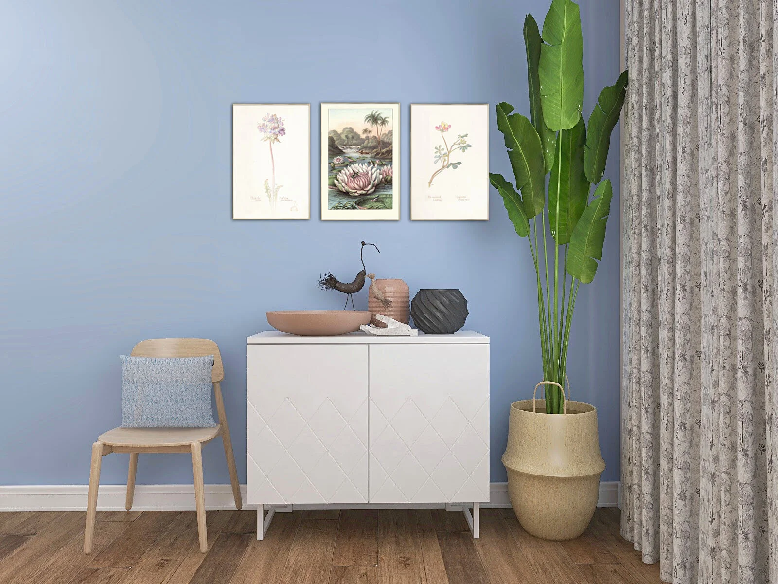
This month I am loving all the beautiful line drawings out there, in particular the work by the artist Peytil, he is also amazing to watch at work where he swishes his brush over the page and hey presto he produces these amazing figures of people. It looks so easy…it is not…I have tried!! The Morgondagg print is so gorgeous, all you need is one! Simple, elegant and understated. Another piece by Liv Due’s Cloudisone print exclusively sold on Peytil website. One of my favourite online shops is Junique where you can find lots of different prints and inspiration.  My favourites this month are the Blue Heron, the Water Lily paired with the Thistle and Lupin prints and the dark and moody, Thorned Bulbous Plant prints. See all these below in some renders I created, with a Farrow and Ball Lulworth blue backdrop. One corner, 5 looks!

Need help with your art selection? I offer bespoke service just to help with that

Work From Home The Right Way

Xz1ytwpvBRcAAQI.jpg

WORK FROM HOME THE RIGHT WAY

Working from home has suddenly become very popular and it’s not going away anytime soon, just like you know what!!

Some things to consider when working from home with a bit of comfort.

Location, Location, Location

Consider your location.  Too close to the kitchen and you could be in trouble but not too far away either in case you need that all important break. Questions to ask yourself, will you have clients visiting?  Do you need to keep an eye on little ones in the house.  Maybe consider a central spot in your home if this is the case.  Need peace and quiet? Then you may need to think about a separate room or studio space to work from. Ever popular garden rooms and studios are perfect for this.  Just make sure you have your electrics and WIFI sorted so you can continue your work.

Light The Way

Xz12kQpvAssAAQ4.jpg

Light it Up

3 types of lighting

3 types of lighting are important to consider in your home office space.

Task…yes, you guessed it, for all the tasks you will be doing, an adjustable desk lamp is best.

Ambient…get as much natural ambient light from your nearest window

Accent…get some atmosphere in there too, in case you need to relax between phone calls, so dress it up with some standard lights, table and wall lamps

Your Room With A View

Increase your feelings of well being by making sure you position yourself to the best view you can.  It is not good for your brain to look up at an uninspiring blank wall.  If there is no window with a bit of nature outside, get that wall painted / papered or a gallery wall in place so you can focus on that when resting your eyes from the computer.

Get The Kit

Storage; although we would all love to be paperless it is sometimes inevitable that you will have bits of paper lying around, keep it under control through different types of storage, trays, filing cabinets and cupboards are great. Don’t forget to make them pretty, who wants to look at a big ugly gey unit. Look for colourful boxes and storage to keep your things together.

Xz1ytwpvBRcAAQI.jpg

Desk, chair and a view

Get the basics right!

Desk and chair; Think about the ergonomics of your desk and chair, too low or too high will not work, you need something that is just right!  It should be big enough for your laptops / PC, somewhere to write, somewhere to put that cuppa too. Consider a standing desk to burn your calories at the same time! Don’t forget to get the best office chair you can with the right support.

Inspiring Ways

Get that room smelling….maybe some lovely essential oils or simple candles to get your sense going! Maybe not the stuff that makes you sleepy….you are there to work remember!

Essential oils discover mag.jpg

Smellies

Essential oils

storage boxes amazon.jpg

Colourful storage

for all your bits and bobs

E - Design: how does it all really work?

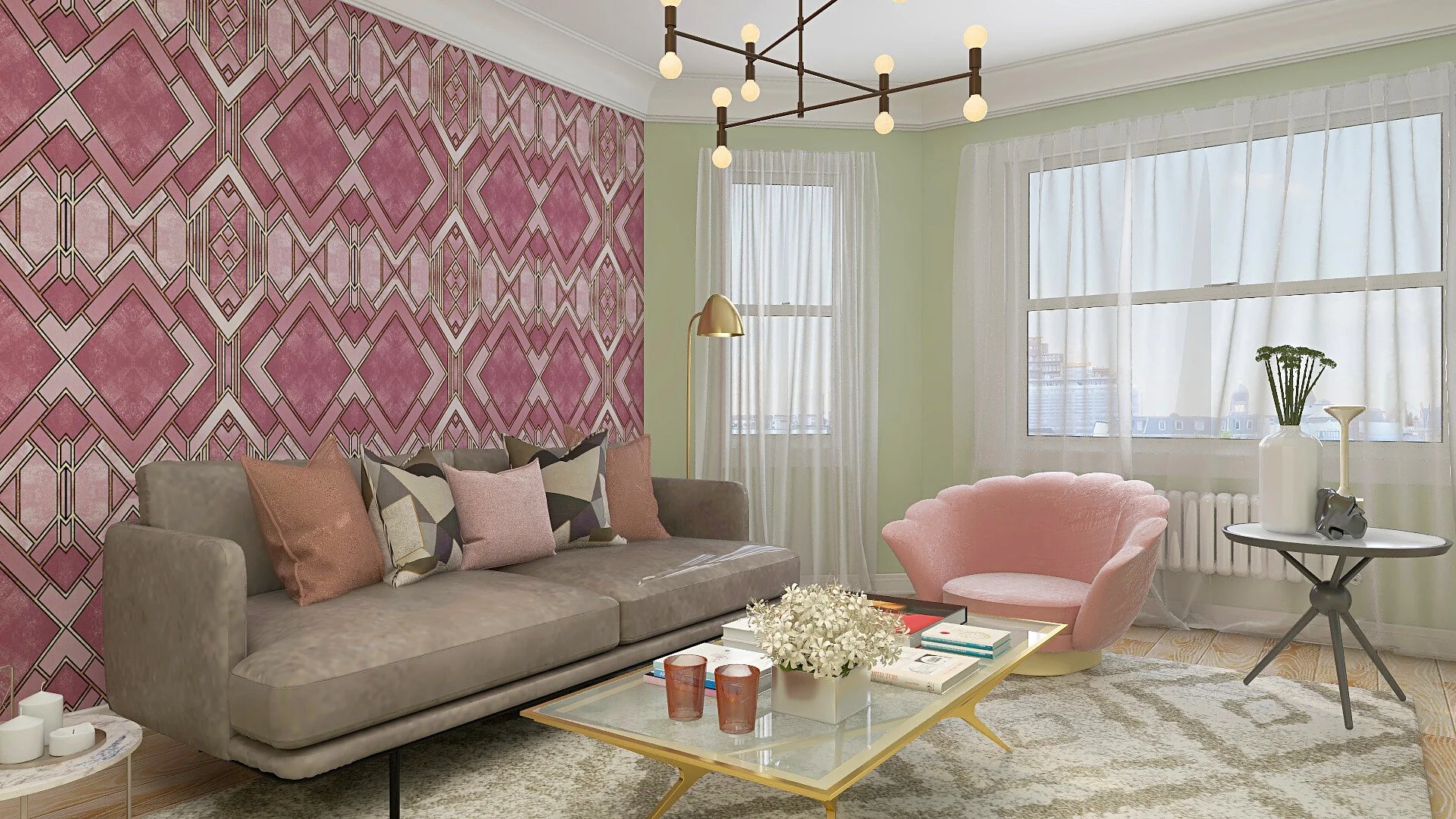
Scheme 1 - Art Deco Wallpaper

Scheme 1 - Art Deco Wallpaper

Scheme 2 - Green Walls

Scheme 2 - Green Walls

E Design:  A true collaboration between designer and client. Affordable, Flexible and Quick!

The new wave in interior design, is online interior design. If you are interested in home design, love a good flick through all the latest magazines but don’t know where to start and don’t want to hire a traditional interior designer then E Design could well be for you.

So…what is this E-Design all about?

E design is a relatively new concept, it’s exactly what it sounds like, virtual decorating, online interior design. A collaborative process between you and your designer, you guessed it, all online. We do everything online, right? We food shop, clothes shop, furniture shop, book travel, we even watch the telly online. So why not hire an interior designer online?

Hands up who doesn’t want to have a beautiful, comfortable home? Maybe you have toyed with the idea of getting professional help and calling in an Interior Designer? But something is holding you back, too expensive, too time consuming, too intrusive. Maybe you like the idea but don’t want someone in your home and you like to be a bit involved in the decorating process, don’t mind getting your paint brush out and love shopping for products.

So, what happens when you do decide to hire an E-designer? The beauty of E-Designers is that we are all different, depending on what you need. You may only want a design concept board and product list, or maybe you just need a furniture floorplan for that awkward space. You may even, just want to see what that extension, you have been dreaming of, on the side of your house, would look like in 3d before you hire an architect and get the builders in!

After you make initial contact, have an email chat with your friendly designer and have decided on what you want and of course on a realistic budget, the process begins…

Collaborative process.

Just because it’s online doesn’t mean it is not a collaborative process! Your designer will want to find out as much about your style as possible, all the things you love and don’t love in a home. How you decorate your home now and what aspirations you have for the new space. Completing a detailed style or function questionnaire or quiz will help your designer get a better understanding of you and your home’s personality. So, you will need to answer questions on colour preferences, types of furniture, flooring, interior styles, furniture you want to keep and even where you normally shop etc..

Pinterest

Your designer will want to get an idea of what your aspirations are, regarding your new space and will ask you to choose some images of the types of styles you love. Collaborating on Pinterest is a great and easy way to show your designer the kind of spaces that you love. If you don’t have Pinterest, don’t fret, emailing images will work just as well.

Measuring your space

As your e-designer, is sitting in the comfort of their own home and can’t quite reach to measure your space, you will be asked to do it! Don’t worry your designer will give you instructions on how to measure correctly.

Why measure? In order to make sure the furniture fits, your designer will need to know the size of your room or rooms so they can make a furniture plan for you. A couple of images or a quick video of your home and a rough sketch of the room also helps the designer get a feel of your existing space.

Getting to work

Next, its over to the designer to get working on transforming your space. As E-designers spend far too much time on the net, browsing for products, they know all the fancy shops to be able to bring your unique design together!  They will create a gorgeous design board, using all the information you have given, called, a shoppable concept board or mood board, with all the items required for the room. If you have multiple rooms your designer will make sure there is a beautiful flow between each room, creating, a seamless cohesive look.

3D Renders

Sometimes, depending on the service you have chosen, the designer is able to create, a photoshop 3D render of your room, this shows you how your space could look with the products and colours together.

Presentation

Your design is then all packaged up into a beautiful, professional presentation with your unique design, finishes, floor plans, renders, installation instructions and an individual product list that are all clickable, taking you to each item’s store details.  What more could you want? All that is left, is for you, to fill those baskets and have fun putting your designed space together.

E design allows access to an affordable, simple, fun, flexible, collaborative process between you and your e-designer, creating beautiful spaces for you to enjoy and your friends to be envious of!!

Bye x

Roisin….

no60interiors.co.uk

(Guest blog post for online retailer, Housecosy (Dec19))